
Visual strategy · Identity · Presentation design
The Caine Group
An industrial identity with a personal connection.
Design by Josh Gooch · Created through Best Branding Solutions
A clear brief.
A meaningful connection.
The Caine Group is a parent company of businesses in the roads construction industry. The brief called for an identity that felt industrial while including an atlas reference with a personal connection to the owner.
My work covered visual design strategy and identity development through the finished logo. We also designed a branded presentation for the company.
01 / Finding the visual idea
From an atlas reference
to intersecting letterforms.
I explored literal atlas and globe imagery before finding a direction in the rounded forms of C and G. Intersecting the letterforms brought the reference into a mark built around the company’s initials.
Early explorations used red and black. Through collaboration with the client, the final palette developed into blue and silver.
02 / The finished identity
A mark and name
that belong together.
The final identity pairs the intersecting mark with a strong wordmark. Together, the initials, typography, and palette give the company a recognizable visual foundation.
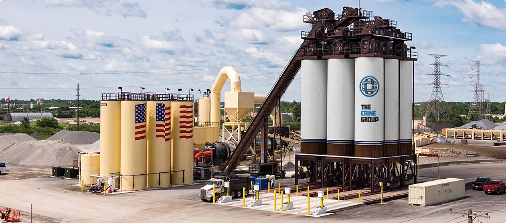
Hard-hat images are presentation mockups showing the identity in context.
03 / Presentation design
Carry the identity
into the conversation.
We designed the eight-slide “Roof to Road” presentation for Jim Russell’s talk at the Carolina Recycling Association’s 33rd Annual Conference & Trade Show.
The deck carries the identity’s blue-and-silver palette and logo into layouts that combine technical information, industry photography, and clear visual hierarchy.
View the presentation PDF ↗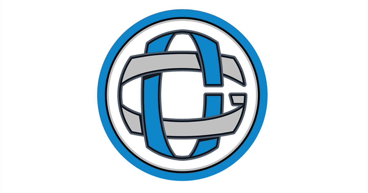
Roof to Road
Wet blending recycled asphalt shingles to manufacture asphalt paving.
Presenter: Jim Russell · 8 slides · CRA conference presentation
A focused identity.
A practical expression.
The project connects a personal brief to an industrial visual identity, then applies that identity to a presentation. Its story is in the design decisions and the finished work.
Let’s talk about your identity ↗© 2026 Josh Gooch / Goochua · North Carolina