LOGO DESIGN · VISUAL EXPLORATION
Small marks. Big character.
A collection of badge-based logo explorations.
These projects use shape, type, and illustration to give each mark its own personality, while keeping the identity compact and memorable.
Explore more work ↗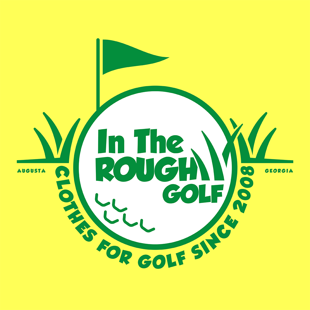
In The Rough Golf · Badge study
THE BRIEF
Let the shape do some of the storytelling.
Badge-style identities bring lettering and graphic elements together inside a flexible shape. They can feel rooted, personal, and easy to apply across packaging, apparel, and other brand touchpoints.
This selection collects distinct directions made for different imagined businesses. Each piece begins with a name and a visual idea, then builds an emblem around it. The collection began as a self-directed design exercise, giving me room to keep developing badge concepts and explore how shape, lettering, and illustration can work together in a compact mark.
FROM FIRST CONVERSATION TO FINISHED WORK
A clear process gives the idea room to take shape.
01 / Start with the name
The words, subject, and imagined audience set the tone for the mark.
02 / Shape the emblem
Typography, illustration, and ornament find a balance inside a compact badge.
03 / Make it usable
A clear silhouette helps a mark hold together across different sizes and applications.
SELECTED WORK
A few marks from the collection.
A selection of badge logo studies, including In The Rough Golf, Lone Pine Cattle Ranch, Backroom Brewing, Castin’ Lines, and Burnt Bean.